


手机分辨率比桌面平台小很多,所以设计手机网站或是移动应用的时候,导航菜单都需要考虑周全,尽量保持简约和易用性高,这里我们整理了5种实用的移动手机App导航菜单设计方案,你可以尝试这些菜单设计模式用在你的新设计项目上,好用而且有新鲜感。
这5种App菜单设计方案也许有很多设计师已经在使用,但不能否认它是目前实用的,而且能提高用户体验的菜单设计方案。下面摘选移动手机UI设计美观、时尚,希望你看了后会有灵感收获,能把你的菜单设计得更棒,好好学习吧。
APP导航设计类型:
- 列表式菜单
- 矩阵、网格式菜单
- 底部菜单
- 顶部菜单
- 扩展菜单
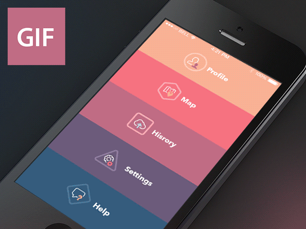
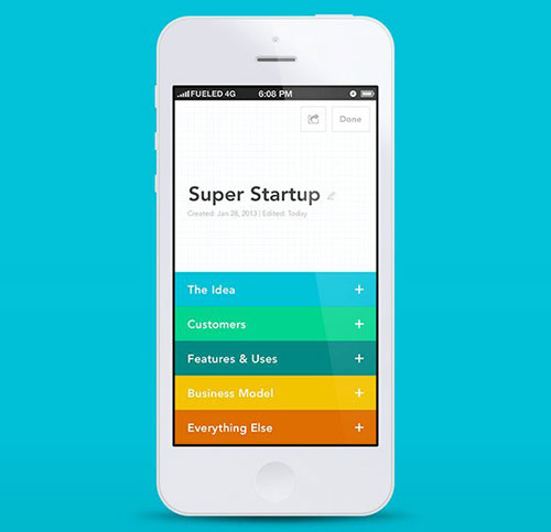
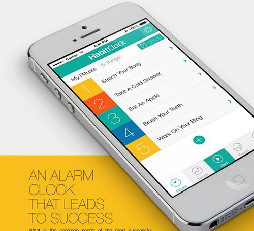
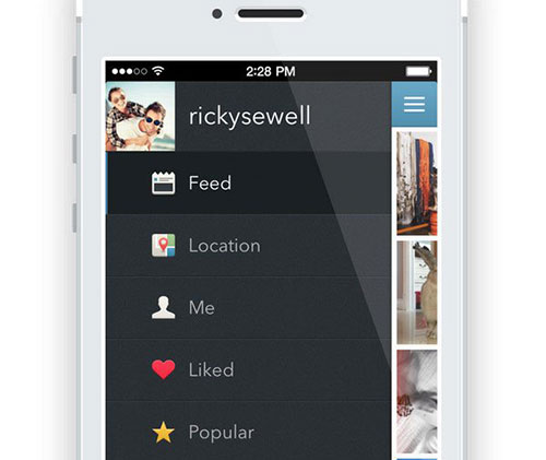
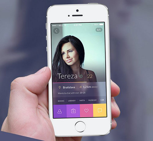
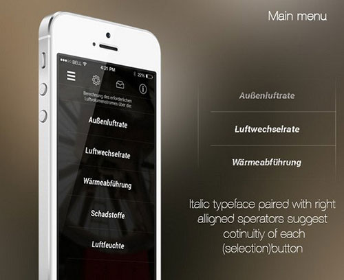
一、列表式菜单
列表式菜单设计这个从网站到手机APP上都很常用的,遵循由上至下的阅读习惯方式,所以使用起来用户不会觉得困难。另外我们可以通过漂亮的配色、图标组合来设计,使得菜单更多加美观。
GIF Aimation
Elevatr
HabitClock App
Instagrab for iOS
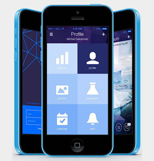
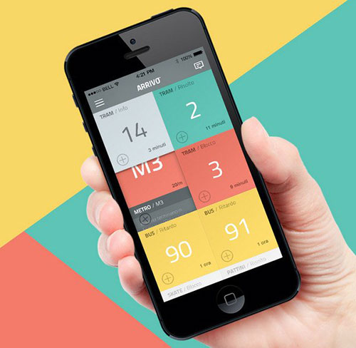
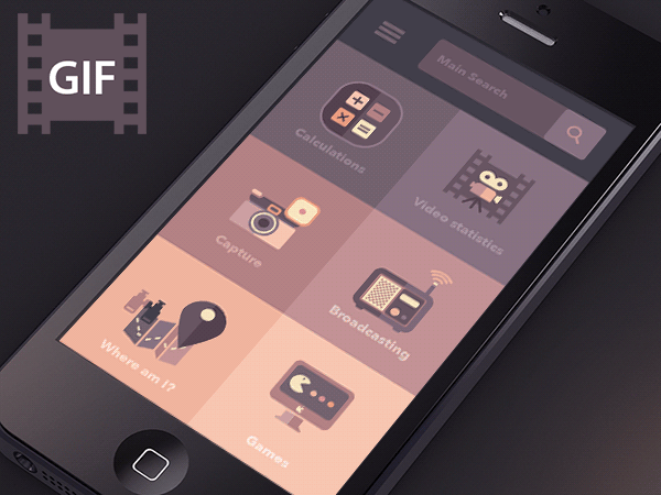
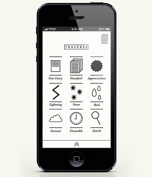
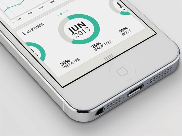
二、矩阵、网格式菜单设计
网格式菜单就类似于metro UI的堆砌色块,优点简约而不简陋,导航清晰、明显,并能提高效率。但设计时切记不分青红皂白的去使用色彩哦,这可能会让用户不知所措和产生疲倦感。
Vectra
Arrivo Mobile App
Abracadabra App
TRAVERSE
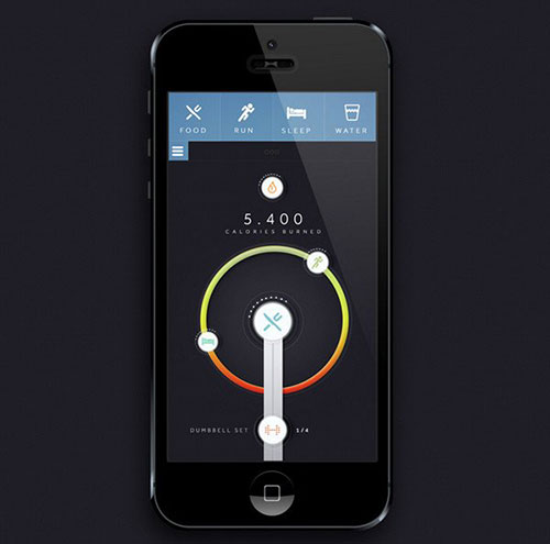
三、底部菜单
底部菜单主要是列出应用程序重要的功能。
Badoo concept
Animated sliding tab bar
四、顶部菜单
顶部菜单和底部意义差不多,把菜单放在顶部,可以遵循上至下的阅读习惯,不过我认为有个缺点就是不能单手操作。
Horner
Discovery Channel
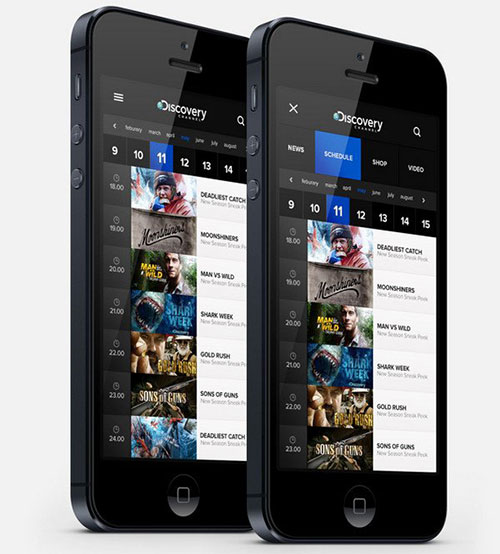
Air flow calculation app
Shario App
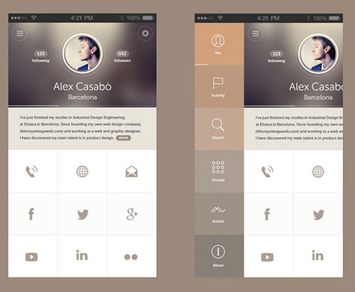
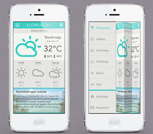
五、扩展菜单
扩展式菜单设计现在连网站也很常用,当我们觉得菜单比较点用位置的时候,可以尝试用这种方式来隐藏菜单,需要注意的是设计展开菜单按钮大部设计在左或右上角这些显示的位置。
MuSeek

Univit UI
SVOY app design
Időkép
总结
从上面5个菜单设计方案中可以看出都有自己的优缺点,所以我们应该选择对你项目最为有效的方案,并能提高用户体验。
原文地址:shejidaren
如果觉得对您的学习有所帮助,请扫描以下的二维码进行捐赠: